DELIVERING A UX APPROACH TO TIFERETH ISRAEL’S WEBSITE
Beginning to Repair TI’s Culture of Immediacy
Increased congregant website traffic by 50% in the first month after launch.
Team: Me (UX Designer & User Researcher), Executive Director (Project Manager), Usability Testers
Tools: InVision, Miro, PowerPoint
Timeline: 5 Months (August – December 2020)
OVERVIEW
ROLE + IMPACT
TI began implementing the Event Planning Service, improving some facets of TI's workflow. However, there were still noticeable issues with TI’s customer service and a lack of business structure. This project focuses on the business ecosystem and designing a creative solution to improve it. I initiated and managed the entire project, which included the following parts:
PROBLEM STATEMENT
The solution should benefit both the TI Staff and the congregants. Discovering the challenges and pain points in TI's workflows was the main driver when entering the research phase.

Data elicitation and user research
Data modeling to analyze research results
Ideation and design (sketches of features and wireframes)
Prototyping medium-fidelity click maps
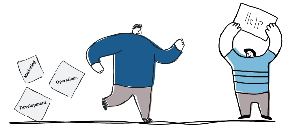
Tifereth Israel Congregation has a deeply rooted history of catering to congregants' needs, fostering a disruptive environment of immediacy. Ultimately, this environment costs TI more time and money and has created new and unnecessary barriers for congregants and potential new members.
Evaluating the prototype with a group of users
RSEARCH: FIELD VISIT
PRE-VISIT PREPARATION
To begin the research phase, I completed a pre-visit preparation that assisted with the discovery phase. I looked at TI from all angles and how it fits within the UX world, decided on data sources, and selected visit parameters.
Painpoints
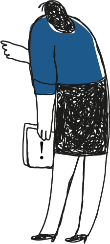
Executive Director is very involved in tasks needed to complete a project.
The raw was a lot of information to sort through. I wanted to quickly translate what I had learned into resources so I could reference them later in the project. The next step led to the post-visit analysis.
POST-VISIT ANALYSIS
I completed three studies to begin distilling and organizing the raw data for my post-visit analysis: an Early User Work Role Model, Initial Flow Diagram, and a WAAD (Work Activity Affinity Diagram). The Initial Flow Diagram that informed the WAAD is below:
TI IN THE MARKET PLACE
Client: Staff/Congregants
Company: Tifereth Israel Congregation
Business: Non-Profit, Synagogue
Domain: Synagogues & Religious Institutions
Product/System: User work practice
DATA SOURCES
Subject Matter Expert Interview
“Be Your own Domain Expert”
Analyze Comms Specialist workflow
VISIT PARAMETERS
1-2 visits into the office (due to COVID)
Interview Executive Director and 1-2 Congregants
Fly on the wall observation of workflow

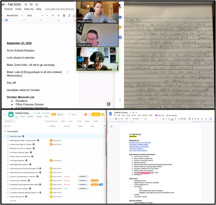
RAW DATA FROM THE VISIT
Using these methods, I collected interview highlights and raw activity work data. The raw activity work data is below.
Frustration because tasks were “completed” only to have details change.
Team had no time to prioritize information before meeting.
TI staff does not use a project management system. They make to-do lists in GoogleDocs.
Tasks are noticeably dependent on other team members’ completion of the work.
Planning is so last minute, that there is no time for an efficient, agile workflow.

Insights
Higher standards are needed regarding the workflow between the congregants, and staff.
Projects do not have a consistent "MOCHA" template (i.e., Assigned roles and job descriptions)
Staff needs to execute project analysis in an organized way, preventing inconsistent work process standards.
In addition to condensing the raw data, completing the post-visit analysis helped me realize what work tasks may be missing within roles – for example; I don't know much about the Executive Directors' specific work tasks.
This process revealed the "back-end" of TI's workflow, the side that TI members don't see and have no idea how intensive it can be.

RESEARCH: ANALYSIS
USER RESEARCH DATA MODELING
After synthesizing the raw work data into clear work activity notes and diagrams, I was ready to analyze. To do this, I completed a Social Model, Physical Work Environment Model, and a User Work Role Model. I defined all target user classes, information needs, and any barriers to usage for each model.
The Physical Work Environment Model affirmed some the cultural issues that impact Staff workflow. These barriers are listed below.

Barriers To Workflow
The "waiting circle" is in front of the receptionist's desk, where members who want immediate assistance stand and wait. This issue is a physical manifestation of a workflow barrier.
The diamond in the middle of the office represents the constant communication and many task dependencies shown by the communication lines.
I ended the data modeling phase with a Hierarchal Task Inventory created to pull together all of the discovered user work roles, tasks, and user classes. The model is pictured below.
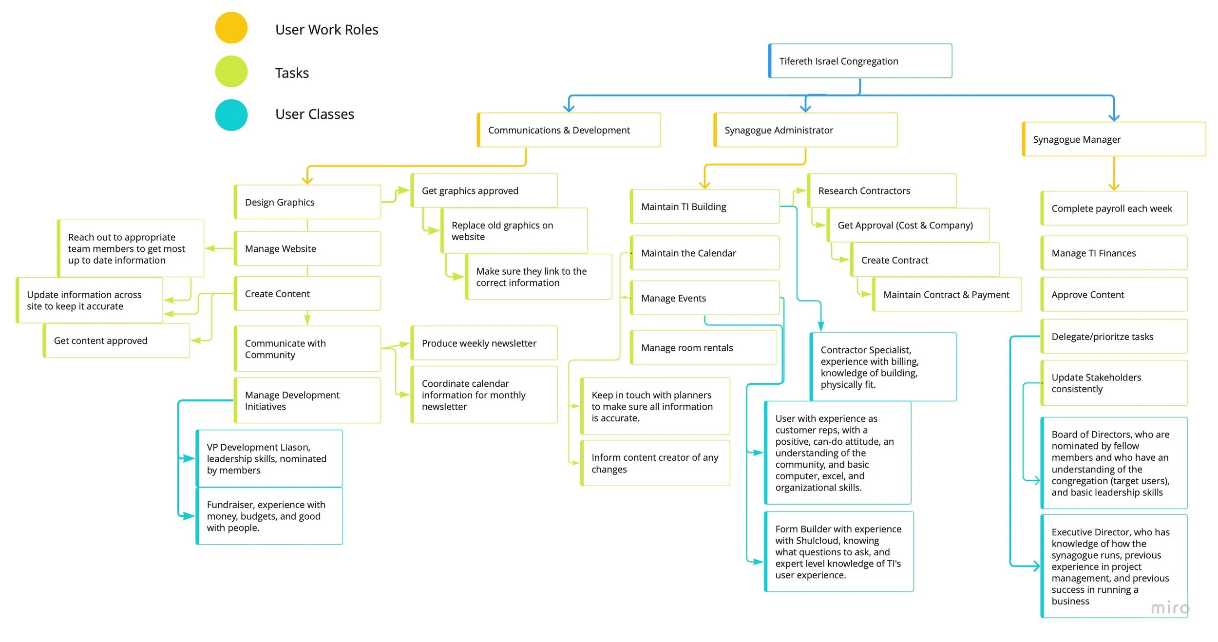
Responsibilities are spread across all work roles in a way that makes them dependent on each other, preventing flexibility and task independence for the staff member. This dependency can cause barriers to completing projects in a timely, organized manner. Everything at TI is overly intertwined, making it challenging to have a structured workflow.

AFTER RESEARCH, BEFORE DESIGN
SKIPPING IDEATION
There was no direct connection between the research and the selected design concept. The client had a set idea in mind, dismissed the opportunity to brainstorm design concepts, and insisted on moving forward. The prototyping phase was challenging for this reason.
However, the selected concept, a homepage re-design, still fit within the project's scope and covered the problems brought to light during the research phase. Although it was not as smooth design-process wise, we were still able to move forward with the design phase.
RESEARCH SUMMARY: CONNECTING THE DOTS
An insight of note from the research phase, influenced by secondary knowledge, is an issue with a task in the Hierarchal Task Inventory Model. It summarizes the research well, exemplifying TI's cultural and workflow problems. This task flow is “replace old graphics on the website —> make sure they link to the correct information.” TI members want to be able to go to the website and "not get lost." They want all the information right in front of their faces when they enter the webpage, and it causes the following problems:
Updating clickable graphics on the website at the command of congregants has led to a homepage jam-packed with information that could be visually easier to digest, especially for a new visitor/non-TI member.
The User Work Role (Communication Specialist) maintaining the information has to dedicate most of their time to keeping the homepage up to date as the event and congregational information constantly changes.
Pages with static content on the website and other essential forms of communication are ignored because it isn't as "easy" to access them.
Congregants have gotten used to having everything at their fingertips or with one click, even if it isn’t the most worthwhile solution. This is where a UX solution comes in.
DATA MODELING & DESIGN
SKETCHING THE CONCEPT
Moving forward with the design concept of making TI's website and homepage more user-friendly, I developed two sketches highlighting some of the main issues with the current website. The sketch below shows what eliminating date-based links (mainly linking to ever-changing calendars/events) on static pages would look like:
CONCEPTUAL DESIGN AS A MAP
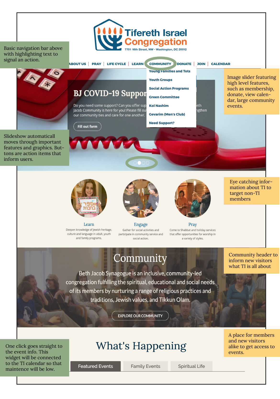
As the first landing point for new members and a valued access point by TI members, I wanted to focus on a new design that carefully balanced targeting new visitors and being accessible and pleasing to TI members. Below is the Conceptual Design Map that visualizes this idea.
Ideally, Tifereth Israel's website is a hub for members and an informative landing page for all information about TI. The struggle in the past has been the balancing act of these two ideas.
SKETCHES OF FEATURES
Next, I sketched features of the conceptual design from three perspectives: ecological, interaction, and emotional. The ecological (yellow) and interaction (green) sketches proved highly insightful, and you can see the combined sketch below with notes.
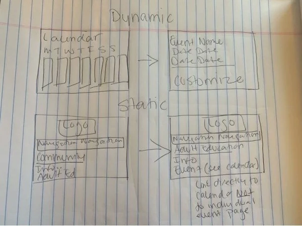
The Problem
TI does not define the use of dynamic and static content on landing pages, which can lead to issues with link tracking when an outdated event is linked to a page with static content (ie. “About Us” has a link to a new Shabbat event)
The Solution
Tying pages with dynamic content directly to the calendar would reduce link issues since all information will come from one place.
Having pages with static information link directly to the calendar, rather to individual events, would add one more "click" but eliminate the potential for error.
TI would benefit from more defined content types on landing pages to help users navigate more efficiently. The goal would be that even with more than one click, the extra step would make logical sense and be of quality to the user.

Design Decisions
Placing high-level features first, such as Membership, Rituals, and Community, in the "Welcome to TI" section.
Showcase a few different ways congregants can access desired information, but divided in a way that keeps the flow of visitors’ thought process intact.
Use a "scroll" layout on the homepage so users are encouraged to interact with the page for more info. This way, the home page is mainly for those who know nothing about TI, but members will know exactly where to go to get information.
Tackling features based on these different perspectives was helpful because I was encouraged to pull from parts of the research phase to ensure the design catered to all aspects of the user's needs.
Tackling features based on these different perspectives was helpful because I was encouraged to pull from parts of the research phase to ensure the design catered to all aspects of the user's needs.
STORYBOARDING
Creating the storyboard was easy due to TI Staff constantly handling congregants calling the office, asking how to find information about an event, even if it is displayed bulletin-board style on the homepage.
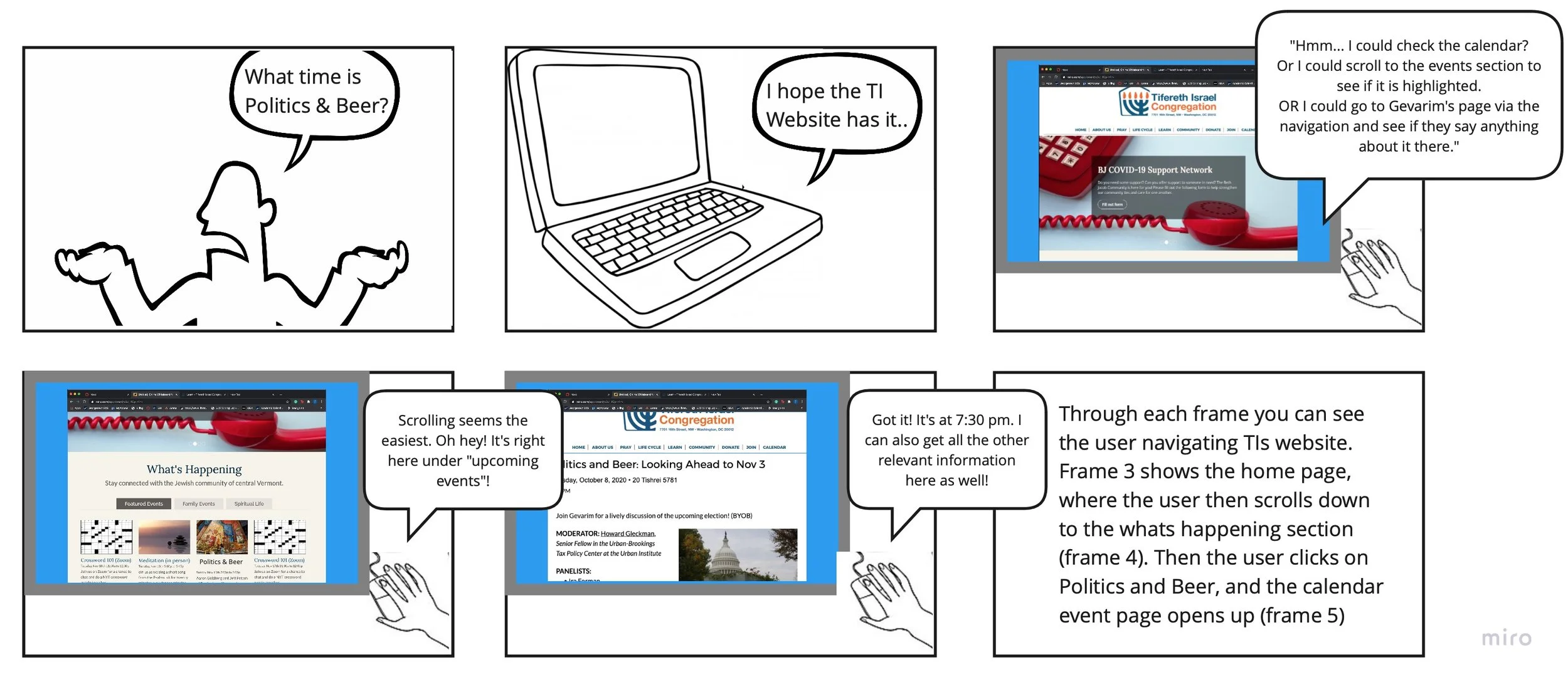
It was helpful to be put in the user's shoes and explore all the different ways they could get the information with the new features from the sketches.
Wanting to ensure that the flow shown in the storyboard was feasible, I created a wireframe based on the current functionality of the platform TI uses, called ShulCloud.
WIREFRAMING
Using InVision, I created a Wireframe for a similar event covered in the Storyboard, Virtual Family Shabbat. There were two ways users could get the information they needed, so I showed both. You can see the wireframe below.

Flow #1
Shows the flow of a user who may not know to scroll down to the "events" section.
They associate Shabbat with praying, click on "Pray at TI," and are directed to a page with static content about rituals.
A rituals-focused dynamic calendar widget is on the right. When clicked, the event they are interested in will go directly to the event landing page with the dynamic content.
Flow #2
Shows what would happen if a user scrolled to the events section on the homepage.
This section targets TI Member's emotional need to have information instantly
Clicking the event takes them directly to the event landing page with the dynamic content.
These design decisions were based on constraints from the TI website platform, ShulCloud. Synagogues are limited to selecting templates, and designers can only go in and override the CSS after the selection. To move forward after selecting features in the sketching phase, I found the closest template to the design vision and used that to model the wireframe.
PROTOTYPING
TESTING
Focusing on the "Congregant" user work role, I created a medium-fidelity click map in InVision, and assigned four users (all of different demographics and community roles) to navigate the TI website to register for the Chanukah event "Candle lighting & Story Telling."
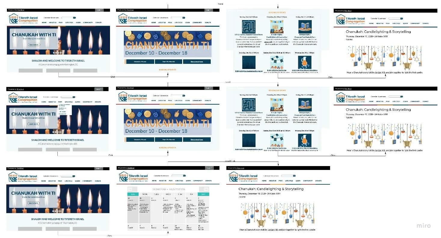
The click map has five ways a user can go from the home page to the information they need within two meaningful clicks. This prototype visualizes what the testers experienced searching for the “Candle lighting and Story Telling” event.
The new design has successfully facilitated one to two-click navigation for what users desire; now, getting users adjusted to change will be the next challenge, and lots of phone calls to the TI staff.
Upon completing the testing phase with congregants, some interesting “long-term” problems were revealed. I wanted to ensure we gave attention to these issues in case stakeholders needed to know about their value, so I did a few minor evaluations.
EVALUATION
To address the discovered and any potential long-term problems, I executed a System Usability Questionnaire and a Thinking Out Loud interview with a user; then, from each, I evaluated all potential ecological, interaction, and emotional problems and brought repetitive ones into a cost-importance analysis, which is below.

How it Helped
Completing this analysis helped prioritize what issues needed attention before the new design launch. I worked through the priority ranking with the Project Manager, who made heavily opinionated decisions but was also shocked by research-proven issues that have been ongoing with TI's website for a while.
I amended the issues labeled "fix in this version” then began the implementation. The development took about four months and involved heavy coding (CSS overriding & HTML). As the sole individual doing the implementation, it was challenging but gratifying upon completion.
Changing the culture of an organization takes work. However, a solution is necessary when it directly impacts the business ecosystem. Although this project did not solve the disruptive nature of the staff/congregant relationship, it was a first and essential step in providing resources that congregants would want to use instead.
PROJECT OUTCOMES
Business Results
Ultimately, the website re-design:
Allows the Communication Specialist to use paid time to focus on essential work priorities
Encourages the retention of new website visitors and potentially brings in new TI members
Created a new "face" for TI that community members can be proud of
Communicates information about the brand, events, and the community efficiently, increasing the likelihood of gaining new members

UX Results
Congregants can now submit events to TI staff and receive consistent results.
The process needed to make the event service successful is now clear frontstage and backstage, allowing for more user control and efficiency.
Without sacrificing congregant user control, TI Staff now has a more efficient and user-friendly way to collect event information.
Radio buttons in the event form (frontstage design) allow for more simplicity so as not to discourage congregants from using the form.

REFLECTIONS
Implementation of the new service was complex with a small, busy team. In the future, I would take more time to focus on the structure of the process and how it fits within TI’s current workflow so that transitioning to the new service would be less daunting.
Staff requested many changes post-implementation, which was frustrating but also helped prove how flexible the new service was, especially when looking at the backstage process.